|
|
|
|
Insights and perspectives on technology, AI, software development, and industry trends from the TrueSolvers team.
iOS 26 arrived on September 15, 2025, as Apple's most dramatic visual overhaul since the flat design revolution of 2013. The Liquid Glass interface introduced translucent, glass-like materials that refract and reflect content, creating depth through transparency. Apple marketed this as making interactions "delightful and elegant," but reality delivered something else entirely.
The core problem stems from how the design actually works. Toolbars, navigation bars, notifications, and control elements all use semi-transparent materials that blend with whatever content sits behind them. Text labels on buttons can be obscured by background images. The refraction effects add shimmer and movement that some users find disoriating. For people who need clear visual boundaries to work efficiently, the default implementation makes basic tasks unnecessarily difficult.
Critical and user reception turned poor quickly. Reviewers criticized performance issues and widespread battery complaints alongside the controversial interface itself. Adoption rates lagged compared to previous iOS releases. The pattern became clear within weeks: Apple had shipped an interface optimized for marketing screenshots, not sustained daily use.
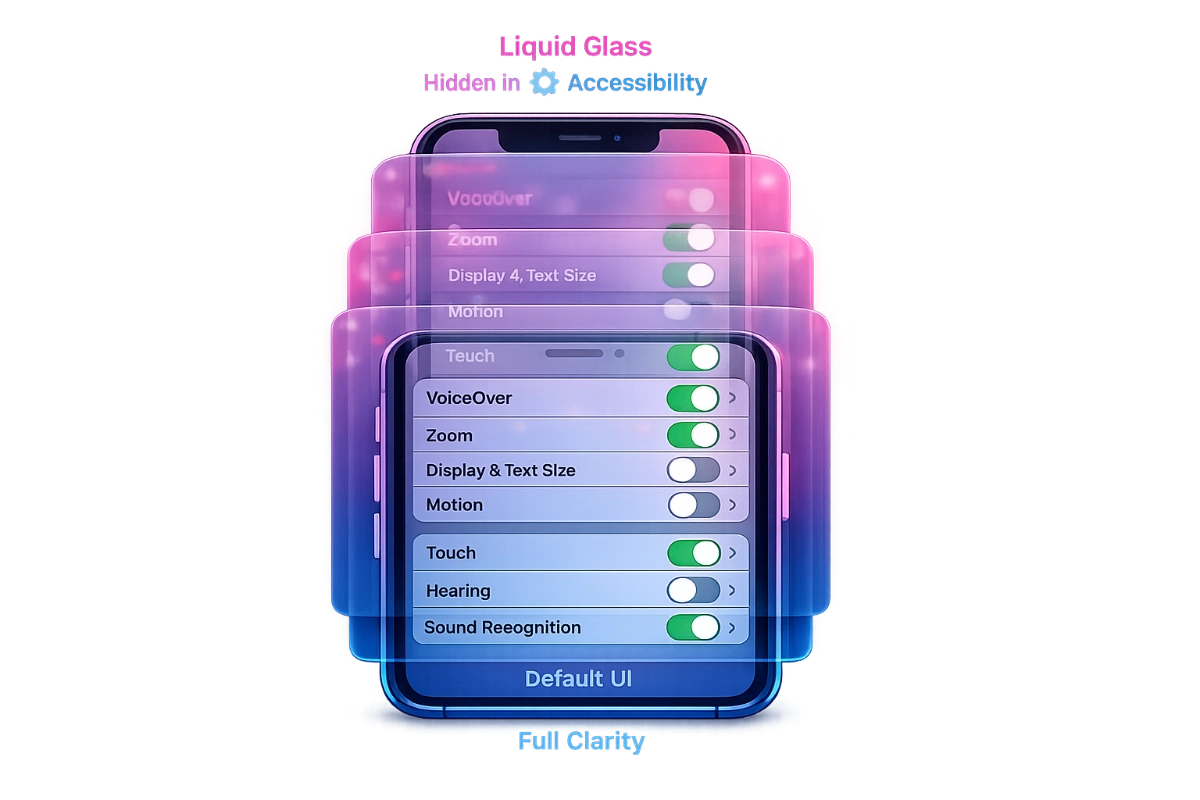
Most users who discover solutions find them by accident or through online searches for headache and eye strain relief. Apple categorized the most powerful tools under Accessibility, creating a discovery barrier. People don't explore accessibility menus when they don't identify as having accessibility needs. But these aren't disability features. They're fundamental usability controls that improve the experience for anyone who values clarity over aesthetics.
Five settings directly address Liquid Glass readability problems:
Reduce Transparency replaces translucent glass with more opaque backgrounds. According to Apple's support documentation, this reduces transparency and blur effects, particularly noticeable in Control Center and notification panels. You'll see darker overlays on background elements rather than see-through materials.
Increase Contrast strengthens color differences between foreground and background elements. Apple's documentation confirms this improves color contrast between app foreground and background colors. It sharpens edges and makes boundaries more distinct.
Show Borders draws visible outlines around interface elements that would otherwise blend together. Apple's official support materials explain this makes controls, buttons, and Control Center easier to see by adding borders around onscreen elements.
Reduce Motion eliminates the fluid animations and refraction effects that give Liquid Glass its liquid quality. This removes the glass distortion visible when swiping to unlock and stops the wobbling animations throughout the interface.
Button Shapes adds visual indicators like underlines beneath Back buttons, making clickable elements more distinguishable from static text. This helps users identify interactive elements without relying on subtle color shifts.
All five live at Settings > Accessibility > Display & Text Size. Apple positions them alongside text size adjustments and color filters, reinforcing the message that they're for users with visual impairments rather than general usability improvements.
Apple added a Liquid Glass style toggle in iOS 26.1, released November 3, 2025, with iOS 26.2 introducing additional hidden controls for managing transparency. Located at Settings > Display & Brightness, it offers two options: Clear for maximum transparency, or Tinted for increased opacity with a frosted appearance. This sounds convenient, but there's a critical limitation Apple's documentation quietly mentions.
The Liquid Glass toggle only functions when both Reduce Transparency and Increase Contrast are turned off. You must choose between the newer quick toggle or the more powerful accessibility settings. They conflict with each other. Enable both systems and the accessibility settings win, rendering the Liquid Glass toggle non-functional.
This creates confusion. Users who enable Reduce Transparency for better readability, then discover the Liquid Glass toggle and try switching to Tinted mode, wonder why nothing changes. The settings don't communicate with each other or warn about the conflict.
For the flattest, most readable interface, combine Reduce Transparency, Increase Contrast, Show Borders, and Reduce Motion all enabled simultaneously. This strips away nearly all Liquid Glass visual effects. Icons lose most translucency. Navigation bars become solid. Animations disappear.
From our detailed study of how these settings layer together, the combination creates something close to pre-iOS 26 visual clarity while maintaining the rounded interface elements and updated layouts. You sacrifice the glass aesthetic completely, but gain immediate readability improvements.
Users wanting some transparency reduction without eliminating all effects can use the Liquid Glass toggle's Tinted option instead. This requires keeping Reduce Transparency and Increase Contrast turned off, accepting their weaker effect in exchange for preserving some glass materials. Add Show Borders separately for window boundary clarity without affecting transparency levels.
The moderate path works better on newer hardware where performance impact matters less. Older devices benefit more from the aggressive accessibility combination.
Platform differences matter significantly. iPad users running iPadOS 26 with windowed multitasking find Show Borders particularly valuable. When multiple app windows are open simultaneously, the border setting makes window boundaries unmistakably clear. Without it, determining where one app ends and another begins becomes guesswork with overlapping translucent frames.
iPhone users prioritize different settings because usage patterns differ. Control Center and notifications appear more frequently on phones than tablets. Reduce Transparency delivers bigger practical benefits on iPhone by making these frequently-accessed overlays more opaque and readable.
Mac users face different limitations entirely. macOS Tahoe lacks Show Borders completely. Increase Contrast provides some similar boundary definition, though users report it looks more garish and cartoony than the iOS implementation. Third-party tools like Alan fill the gap by drawing borders around active windows, making it obvious which window has focus.
Apple's decision to implement Show Borders on iOS and iPadOS but not macOS suggests different design priorities across platforms. The omission feels particularly odd given that Mac users with multiple desktop windows arguably need boundary clarity even more than iPad users.
Apple warned during the iOS 26 rollout that the update could impact battery life because the interface is more graphically demanding. The company's messaging framed this as temporary, citing normal indexing and app updates immediately after installation. But the underlying reality goes deeper.
Liquid Glass requires GPU rendering for real-time refraction and reflection effects. Those glass materials that shift and shimmer as content moves behind them demand continuous processing. Disabling these effects through accessibility settings reduces GPU load.
The performance benefit shows most clearly on older supported devices. iOS 26 requires an Apple A13 Bionic chip or newer, dropping support for iPhone XS, XS Max, and XR. Devices at the minimum spec (iPhone 11 through iPhone 13 with A13-A15 chips) struggle more with the rendering demands than newer hardware.
Users report modest battery life improvements when enabling Reduce Transparency and Reduce Motion on these older devices. The effect isn't dramatic, but it's measurable. More significant is the reduced cognitive load. When your brain doesn't have to constantly parse overlapping translucent elements, the device feels faster even when objective performance metrics show minimal change.
Newer devices with A16 or A17 chips handle the rendering more efficiently. These processors support additional visual effects like specular highlights on app icons and the Dock. Apple tiered the experience based on chip capability, creating a situation where some users get the full Liquid Glass treatment while others see a simplified version.
Alan Dye, the VP of Human Interface Design who led Liquid Glass development, left Apple for Meta shortly after the iOS 26 launch. The timing coincided with iOS 26.2's release on December 12, 2025, which added yet another transparency control: a slider adjusting Lock Screen clock opacity.
Apple replaced Dye with Stephen Lemay, whose career focused on interface and interaction design rather than visual aesthetics. The executive change signals a shift in design philosophy. While Dye's departure didn't appear forced, the combination of his exit and continued transparency adjustments through iOS 26.1 and 26.2 suggests Apple acknowledges implementation problems.
The progression tells the story. Developer Beta 3 made navigation bars more opaque after legibility complaints during initial testing. iOS 26.1 added the system-wide Liquid Glass toggle. iOS 26.2 added the Lock Screen control. Each update provides more user customization rather than changing the default aesthetic.
From our findings of Apple's response pattern, this represents the company's standard playbook when facing design backlash: double down on customization without admitting the default was wrong. The same thing happened with iOS 7's transparency and motion effects in 2013, which eventually required accessibility settings to tone down.
Craig Federighi disclosed that designers actually fabricated physical glass samples with various opacities in industrial design studios to match interface properties to real glass behavior. That level of detail in replicating glass optics suggests genuine commitment to the visual concept. But accurate glass simulation doesn't automatically mean good interface design.
The fundamental tension remains unresolved. Apple values the default aesthetic highly. Marketing materials showcase Liquid Glass prominently. But real-world usage patterns and diverse user needs force compromise. The company's solution puts powerful controls in places users don't naturally explore, then slowly adds weaker alternatives in more visible locations after complaints mount.
Users now have agency to customize their interface extensively. But they must know these options exist. The Accessibility categorization creates stigma and inhibits discovery. Until Apple moves these fundamental usability controls out of settings menus designed for disability accommodations, millions will continue struggling with an interface that has built-in fixes they never find.
Apple's Liquid Glass interface launched with serious readability problems, but the company placed five powerful fixes in Accessibility settings where most users never look. Understanding how these controls interact reveals why millions struggle with an interface that has built-in solutions they don't know exist.
Boost your workflow with our browser-based tools
Share your expertise with our growing community. We accept in-depth articles on Tech, AI, and Dev.
Get StartedFinished reading? Continue your journey in Tech with these hand-picked guides and tutorials.