|
|
|
|
Insights and perspectives on technology, AI, software development, and industry trends from the TrueSolvers team.
Liquid Glass applies semi-transparent materials across buttons, sliders, and notifications that refract and reflect content in real time, according to Apple's official documentation. The company designed this to make iOS 26 "more expressive and delightful" without sacrificing familiarity. What Apple didn't anticipate was how drastically different wallpapers, lighting conditions, and individual visual processing abilities would affect legibility.
The transparency creates overlapping interface elements that reduce contrast between text and backgrounds. Notifications layer over wallpapers with insufficient opacity, making message previews difficult to scan quickly, a readability challenge that Apple continues addressing across hardware and software, from iPhone 18 Pro's under-display camera to iOS interface transparency controls. Control Center buttons blend into busy backgrounds, forcing users to squint or tap carefully to avoid mistakes. The Lock Screen clock, despite Apple's adaptive sizing feature, can disappear entirely against certain photo wallpapers.
These aren't edge cases. Community forums reveal users reporting eye strain, visual fatigue, and genuine difficulty focusing on text when semi-transparent elements overlap. Perfect eyesight versus visual impairments creates dramatically different Liquid Glass experiences. What looks sophisticated in Apple's marketing photos becomes an accessibility barrier in bright sunlight or for users with low vision conditions.
Battery life adds another consideration. The real-time refraction, reflection, and motion effects require continuous GPU processing. Older iPhone models handling these computational demands see modest but noticeable battery drain during extended use.
iOS 26.2 addresses Lock Screen readability through a granular transparency slider, but discovering it requires knowing exactly where to look. The setting exists only for users who selected the Glass clock style, creating a discoverability problem where those who chose Solid to escape transparency never see the customization option.
Accessing the control requires specific steps:
Long-press your Lock Screen wallpaper until the customization menu appears
Tap Customize, then tap directly on the clock display
Verify the Glass option is selected (not Solid)
Adjust the transparency slider that appears below font options
The slider works across all Lock Screen font choices, allowing opacity adjustments from extremely clear to nearly opaque. This granular control lets you balance visual sophistication against practical readability based on your specific wallpaper.
Apple describes this as a "more dramatic" adjustment compared to the binary controls in iOS 26.0 and 26.1. The slider responds to immediate visual feedback, so you can preview transparency levels against your wallpaper before confirming changes. If your clock remains difficult to read even at maximum opacity, switching to Solid provides completely opaque text.
The Lock Screen slider operates independently from system-wide transparency settings. Adjustments here affect only the clock display, leaving notifications, Control Center, and app interfaces unchanged. This surgical approach lets you fix the most visible readability problem without modifying the entire OS appearance.
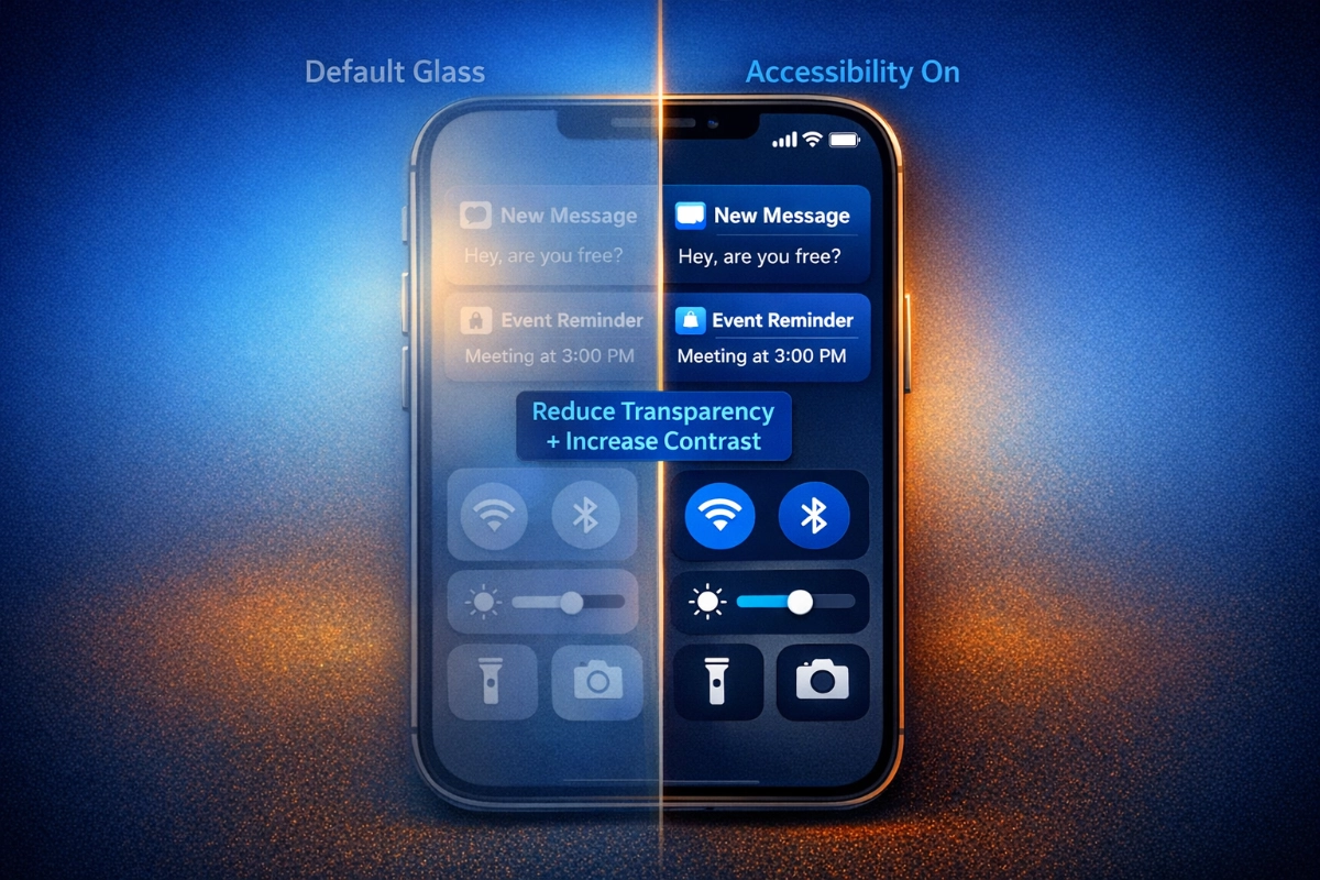
Beyond the Lock Screen slider, iOS already contained accessibility features capable of transforming Liquid Glass readability throughout the entire system. Reduce Transparency sits in Settings under Accessibility, then Display & Text Size, and it delivers the most dramatic impact of any single control.
Enabling Reduce Transparency adds darker backgrounds to translucent areas like Control Center, app icons, and folders. The setting increases contrast between system interface elements and the content behind them without eliminating the iOS 26 visual aesthetic entirely. Buttons maintain their rounded, modern design while gaining opacity that makes them immediately recognizable against any wallpaper.
This isn't a complete Liquid Glass removal. The setting applies a frosted effect that approaches the visual clarity of pre-iOS 26 interfaces while preserving the design language's fundamental characteristics. Text remains crisp, icons stay legible, and the interface feels cohesive rather than reverting to older iOS versions.
For quick access without navigating through Settings menus repeatedly, you can add Reduce Transparency to Accessibility Shortcuts. This enables triple-click side button toggling, letting you switch the setting on and off instantly based on current conditions. Bright outdoor environments might warrant full transparency reduction, while dim indoor lighting lets you appreciate the glass effects with less strain.
Upon thorough examination of user feedback patterns across community forums and tech publication comments, Reduce Transparency emerges as the most frequently recommended solution for Liquid Glass readability complaints. Users consistently report immediate legibility improvements without feeling they've abandoned the iOS 26 update entirely. The setting strikes a practical balance between accessibility needs and Apple's design vision.
You can also add the Accessibility Shortcut button directly to Control Center for even faster access. This puts transparency control alongside brightness and volume, treating it as an environmental adjustment rather than a permanent configuration choice.
Reduce Transparency works powerfully alone, but layering it with Increase Contrast and Reduce Motion creates compounding effects that address multiple readability dimensions simultaneously.
Increase Contrast lives in the same Settings path as Reduce Transparency (Accessibility, then Display & Text Size). It sharpens the distinction between foreground and background colors, making text and buttons more legible against glass-like surfaces. The effect becomes particularly noticeable on complex wallpapers where subtle color variations previously made interface elements blend together.
Combining Reduce Transparency with Increase Contrast removes most translucency from icons and system elements. This pairing suits users who prioritize maximum legibility over visual flair. The interface maintains iOS 26's rounded aesthetic and general design principles while eliminating the optical effects that cause readability problems.
Reduce Motion (Settings, Accessibility, then Motion) disables parallax effects and fluid morphing animations throughout iOS 26. This addresses a different readability dimension: the dynamic lighting shifts and movement effects that some users find distracting during extended use. Spatial scenes that add 3D effects to photo wallpapers and respond to iPhone movement disappear when Reduce Motion activates.
Strategic setting combinations based on specific needs:
Maximum readability: Enable all three settings (Reduce Transparency + Increase Contrast + Reduce Motion) for the clearest possible interface with minimal battery drain
Balanced approach: Enable only Reduce Transparency to maintain some glass aesthetic while improving text contrast significantly
Motion-sensitive users: Combine Reduce Motion with Reduce Transparency to eliminate animations while maintaining color fidelity
Battery optimization: Enable Reduce Transparency and Reduce Motion together to decrease GPU processing demands on older iPhone models (11-14 series)
Third-party apps using Apple's system UI layers automatically adopt these transparency and contrast settings. Custom-designed apps may display their own visual effects regardless of your preferences, though most major applications respect system-level accessibility choices.
The settings work independently, so you can experiment with different combinations to find what serves your visual needs and aesthetic preferences. There's no requirement to enable all three simultaneously unless your specific situation demands maximum clarity.
iOS 26.1 introduced a system-wide setting at Display & Brightness, then Liquid Glass, offering choice between Clear (original high transparency) and Tinted (increased opacity). This provides a middle ground distinct from accessibility settings, and understanding when to use each approach matters for optimal customization.
Tinted mode increases opacity while maintaining the Liquid Glass visual language more faithfully than Reduce Transparency does. The setting adds a color wash to translucent elements that matches your wallpaper's dominant tones, creating visual cohesion between interface and background. Apps and notifications on the Lock Screen gain opacity without the aggressive frosting effect that Reduce Transparency applies.
The menu includes preview functionality, so you can compare Clear versus Tinted appearances before confirming your selection. This visual comparison helps you understand whether the opacity increase solves your readability problems or if you need the more dramatic intervention that accessibility settings provide.
From our detailed study of how Apple positioned these controls across different Settings menus, the separation reveals intentional user segmentation. Casual users seeking minor adjustments find Tinted mode in the obvious Display & Brightness location. Users needing comprehensive accessibility modifications discover more powerful tools in the Accessibility menu. This architecture assumes different user needs rather than treating all readability concerns identically.
Tinted mode works alongside accessibility settings rather than replacing them. You can enable Tinted and still use Reduce Transparency if needed, though the combined effect approaches complete opacity that may eliminate Liquid Glass characteristics you wanted to preserve. Testing different combinations reveals which balance serves your priorities.
The Clear option intensifies transparency beyond iOS 26's default levels, creating an even more glass-like appearance. Most users find this reduces rather than improves usability, but it exists for those who want maximum translucency and have wallpapers that maintain sufficient contrast.
The Lock Screen clock offers a Solid option that completely abandons transparency for that specific element. This represents Apple's acknowledgment that some wallpaper and visual need combinations simply cannot accommodate glass effects without sacrificing fundamental legibility.
Solid mode renders the clock with full opacity and enhanced contrast, ensuring readability regardless of wallpaper complexity or lighting conditions. The setting preserves all Lock Screen functionality while prioritizing information clarity over aesthetic sophistication.
Choose Solid when your preferred wallpaper contains busy patterns, high contrast areas, or colors that conflict with any level of clock transparency. Photo wallpapers featuring bright skies, complex textures, or dramatic lighting often make even maximum opacity Glass settings difficult to read at a glance. Solid eliminates the guesswork by guaranteeing the clock remains immediately visible.
The choice between Glass with maximum slider opacity and Solid comes down to whether you value maintaining visual consistency across the Lock Screen. Glass at high opacity preserves the translucent aesthetic even if barely perceptible, while Solid makes a definitive statement that function outweighs form for this critical interface element.
You can switch between Glass and Solid repeatedly without affecting other Lock Screen customizations. Font choices, color selections, and widget placements remain unchanged, so experimenting with both options costs nothing beyond a few seconds of configuration time.
Apple maintained Solid as an option through iOS 26.2 despite expanding Glass customization, suggesting the company recognizes some users will always prioritize clarity over the design language's visual ambitions. There's no penalty for choosing Solid beyond losing the glass aesthetic for your clock display.
Reducing transparency and motion decreases GPU processing demands by eliminating real-time refraction, reflection, and parallax calculations. The battery impact proves modest but noticeable, particularly on iPhone 11 through iPhone 14 models where every percentage point matters during extended use. Newer iPhone 15 and 16 models handle these effects more efficiently, making the battery savings less significant. If you frequently find yourself reaching for a charger before day's end, enabling both settings provides measurable improvement alongside the readability benefits. The effect compounds during heavy usage days with multiple apps and frequent Lock Screen checks.
Accessibility settings function with any wallpaper, but certain combinations deliver better results. Reduce Transparency works most effectively with medium-contrast wallpapers where the frosted effect can establish clear visual separation between interface and background. Extremely dark or extremely bright wallpapers may still create readability challenges even with all accessibility settings enabled. Solid color wallpapers or subtle gradients provide the clearest interface regardless of your transparency and contrast choices. If you're struggling with readability despite enabling all accessibility features, switching to a simpler wallpaper often proves more effective than further settings adjustments.
Every setting discussed here functions as a simple toggle you can disable instantly. Reduce Transparency, Increase Contrast, and Reduce Motion each have on/off switches in their respective Settings menus. The Liquid Glass Clear/Tinted choice switches with a single tap. Lock Screen transparency returns to default by moving the slider back to its original position or switching to the Glass style's default setting. If you enabled Accessibility Shortcuts for quick access, triple-clicking your side button toggles Reduce Transparency without navigating through Settings. There's no permanent commitment to any configuration, and you can experiment freely without worrying about complicated restoration procedures.
iOS 18 and earlier versions used a flatter design language without Liquid Glass's translucent effects. Those interfaces provided clearer default readability but lacked the visual sophistication and unified design language Apple introduced in iOS 26. Staying on older iOS versions means missing security updates, new features across apps and system functions, and compatibility with newer accessories and services. The accessibility settings and Tinted mode in iOS 26.2 let you achieve readability levels comparable to iOS 18 while maintaining access to current features and security patches. Unless you have a specific app or workflow that breaks in iOS 26, using accessibility settings provides better long-term value than avoiding the update entirely.
Enabling Reduce Transparency and Reduce Motion actually improves performance on older iPhone models by reducing GPU workload. The interface feels slightly more responsive during animations and transitions because the processor isn't calculating real-time refraction and parallax effects. iPhone 11, 12, and 13 users often report smoother scrolling and faster app switching with these settings enabled. Increase Contrast has negligible performance impact since it primarily affects color rendering rather than motion calculations. The performance gains won't transform an aging iPhone into a new device, but they help maintain usability as hardware ages and iOS updates become more demanding.
Apple's iOS 26.2 update added Lock Screen transparency controls, but the most powerful readability fixes already exist in accessibility settings most users ignore. Combining Reduce Transparency with Increase Contrast transforms the entire interface more dramatically than any toggle Apple promotes. Understanding which settings to adjust and how to layer multiple controls turns Liquid Glass from visual frustration into a genuinely personalized experience.
Boost your workflow with our browser-based tools
Share your expertise with our growing community. We accept in-depth articles on Tech, AI, and Dev.
Get StartedFinished reading? Continue your journey in Tech with these hand-picked guides and tutorials.