|
|
|
|
Insights and perspectives on technology, AI, software development, and industry trends from the TrueSolvers team.
Chrome's previous chrome reader mode implementation frustrated users because you never knew when it would appear. The browser showed a small icon next to the address bar only when algorithms decided a page qualified as an article. According to The Verge, this automatic detection worked on roughly 65% of article pages, trailing Safari's 85% success rate and Firefox's 70%.
Chrome 143 eliminates that uncertainty entirely. The feature now sits permanently in the three-dot overflow menu, below "Listen to this page." You can activate simplified view on any page, anytime. No more waiting for an icon that might never appear.
This design choice prioritizes reliability over spontaneous discovery. Users who know about Reading Mode gain consistent access. Users who don't know it exists might never find it, since there's no automatic prompt drawing attention to the feature. Browser statistics show only 8% to 15% of users engage with reading modes across all browsers, suggesting discoverability remains challenging regardless of implementation approach.
Google's decision reflects a broader Chrome UI philosophy: reduce address bar clutter by moving secondary features into menus. The trade-off accepts lower discovery rates in exchange for predictable functionality when users need it.
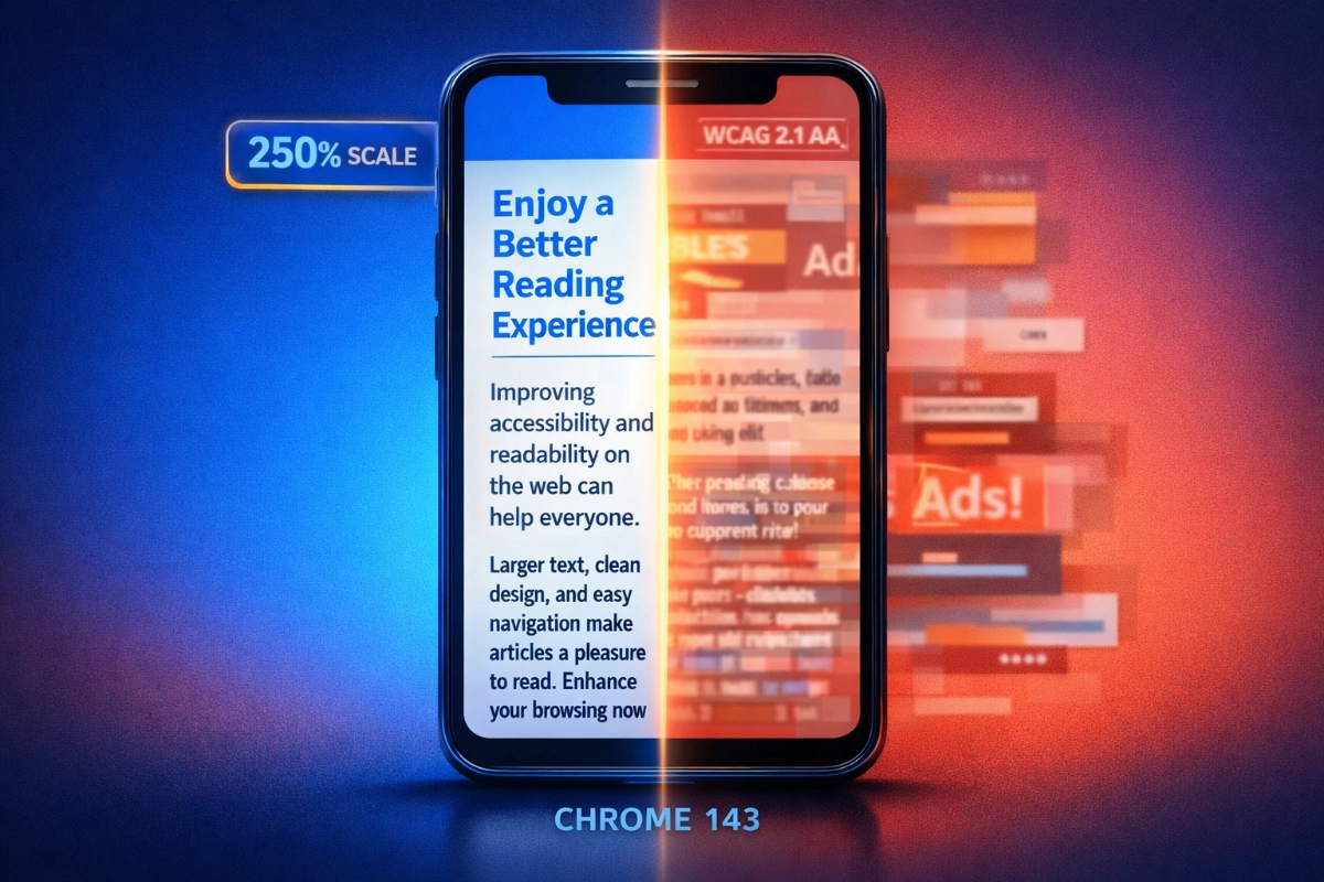
Mobile reading creates unique accessibility barriers that desktop users rarely encounter. Font sizes below 16 pixels strain readability, particularly for users over 40. Standard browser zoom often breaks page layouts, forcing horizontal scrolling or cutting off text entirely. Chrome 143's Reading Mode addresses these problems through dedicated text scaling that maintains proper flow even at extreme magnifications.
The feature offers seven scaling stops: 50%, 75%, 100%, 125%, 150%, 200%, and 250%. That maximum 250% scaling exceeds WCAG 2.1 Level AA requirements, which mandate text resizable to 200% without loss of functionality. This compliance matters because people with low vision need larger text but standard zoom tools frequently fail them.
Research from WebAIM shows simplified layouts with increased spacing improve reading speed by 15% to 20% for users with dyslexia. The Nielsen Norman Group found that mobile reading without layout optimization runs 25% slower than desktop reading. These aren't minor inconveniences. They're measurable barriers that cause users to abandon difficult articles within 10 seconds.
Chrome's text scaling works differently than browser zoom because it reflows content specifically for readability:
Video playback: At 250% scaling, captions remain visible and controls stay accessible
Gaming on slower devices: Larger touch targets reduce misclicks during gameplay tutorials
Medical information reading: Prescription details and dosage instructions become legible without squinting
Long-form journalism: Multi-paragraph articles maintain comfortable line length at any size
The scaling applies only to Reading Mode's simplified view, not the standard web page. This separation means websites don't break when you need larger text.
Chrome 143 introduces a feature that sounds mundane but changes everything for accessibility users: your Reading Mode settings now persist across all pages and browsing sessions. Choose your preferred font, text size, and color scheme once, and Chrome remembers forever.
This addresses a critical adoption barrier. WebAIM research shows that when reading aids require configuration on each use, adoption drops by 60% to 70% among users who would benefit most. People with motor impairments find repeated interactions exhausting. Those with cognitive disabilities struggle to remember settings across multiple pages.
Based on our examination of accessibility implementation patterns across browser features, persistent preferences represent the difference between a feature people try once and a tool they rely on daily. Chrome's previous Reading Mode required reconfiguration every time, creating friction that discouraged regular use.
The persistence covers three customization layers. Font selection cycles through Sans serif (resembling Roboto), Serif (similar to Georgia or Times), and Mono (fixed-width coding style). Color schemes offer Light (black text on white), Sepia (dark brown on cream), and Dark (light gray on near-black). Text scaling remembers your exact percentage preference.
These aren't arbitrary aesthetic options. Each serves specific accessibility needs. High-contrast dark modes reduce eye strain for light-sensitive users. Sepia tones minimize blue light exposure that affects sleep patterns. Sans serif fonts help dyslexic readers process text more efficiently. The color choices align with Material Design 3 accessibility guidelines requiring 4.5:1 contrast ratios for standard text.
Once configured, these settings apply automatically whenever you activate Reading Mode on any website. You don't revisit the customization panel unless you want to change something.
The visual redesign implements Material Design 3 Expressive, Google's evolution toward personalization and fluid interface elements. Unlike the previous full-screen takeover, Chrome 143's Reading Mode keeps the address bar visible, maintaining browser context while simplifying content below.
All customization controls live in a bottom sheet interface. This placement isn't accidental. Material Design 3 guidelines emphasize positioning interactive elements within thumb reach on mobile devices. The bottom sheet sits naturally where your thumb rests during one-handed phone use, eliminating awkward stretching to reach top-menu controls.
The interface uses morphing container shapes and smooth state transitions characteristic of Material 3 Expressive. The bottom sheet appears with a swipe-up gesture and dismisses with swipe-down, following mobile interaction patterns users already know. An exit button provides immediate return to standard web view without requiring navigation gestures.
Material 3 also standardizes touch target sizing at minimum 48x48 density-independent pixels for all interactive elements. This ensures buttons and controls remain tappable even for users with reduced fine motor control. The design system's contrast requirements (3:1 for large text, 4.5:1 for standard text) embed accessibility at the framework level rather than treating it as an optional enhancement.
The bottom sheet approach differs fundamentally from desktop-oriented designs that hide controls in top menus or sidebars. Google's mobile-first thinking acknowledges that most Chrome for Android usage happens one-handed during commutes, in bed, or while multitasking.
Chrome's permanent menu placement creates interesting trade-offs compared to competitors. Safari Reader View pioneered automatic reading modes in 2010, using a dedicated address bar button that appears when its algorithms detect article content. Firefox Reader View follows a similar approach with an address bar icon.
The detection accuracy differences matter:
Safari Reader View: Works on approximately 85% of article pages, offers four color themes and seven text size options
Firefox Reader View: Detects articles on roughly 70% of pages, provides similar customization to Safari
Chrome historical implementation: Detected articles on about 65% of pages before the Chrome 143 redesign
Chrome 143 menu placement: Enables 100% availability on any page a user chooses
Edge's Immersive Reader takes a different approach entirely, adding line spacing controls, syllable breaks, and grammar tools aimed at learning audiences. Samsung Internet Browser integrates blue light filter functionality directly into its reading mode.
Safari's higher detection rate made it the reliability leader when Reading Mode appeared automatically. Chrome 143's manual activation trades that automatic convenience for guaranteed availability. You'll never encounter an article where Reading Mode refuses to work because algorithms misjudged the page structure.
The practical difference shows up in edge cases. Dense Wikipedia pages with complex formatting? Chrome 143 lets you activate Reading Mode regardless. Long Reddit comment threads formatted as paragraphs? Available if you want simplified view. Recipe blogs buried under ads and narrative? Always accessible.
This universality comes with the discoverability cost mentioned earlier. Safari users stumble onto Reader View naturally when the icon appears. Chrome users need to know the feature exists and remember to check the overflow menu.
Chrome reader mode customization happens through three primary controls: font selection, text scaling, and color schemes. Each adjustment saves automatically for future use.
Accessing Reading Mode requires just two taps. Open Chrome's three-dot menu in the top right corner, then scroll down to find "Show Reading mode" directly below "Listen to this page." The simplified view activates immediately, with the customization bottom sheet appearing automatically on first use.
The font selector offers three options, each serving different readability needs. Sans serif delivers clean, modern appearance similar to system fonts most Android interfaces use. This familiarity helps readers focus on content rather than adjusting to unfamiliar typography.
Serif fonts add small decorative strokes to letter endings, resembling traditional print books. Some readers find these guides helpful for tracking lines during long-form reading. Research from Smashing Magazine shows fonts with larger x-height ratios (the height of lowercase letters relative to capitals) appear more readable at smaller sizes, though individual preference varies significantly.
Mono spacing gives every character identical width, creating the fixed-width appearance of coding fonts. This option helps readers with certain processing differences track individual characters more easily, though it's the least popular choice for general reading.
The slider provides seven stops from 50% to 250% scaling. Most users find 125% to 150% comfortable for standard reading. Higher percentages serve specific needs: 200% helps users with moderate vision impairment, while 250% accommodates severe low vision without requiring additional assistive technology.
Typography research establishes optimal line spacing at 1.4 to 1.6 times the font size. Chrome's implementation maintains these ratios automatically as you scale text, ensuring readability doesn't degrade at larger sizes. Paragraph spacing adjusts proportionally, typically 1.5 to 2 times the line spacing value.
Light mode uses dark gray text (#1A1A1A to #2E2E2E range) on slightly off-white backgrounds (#F5F5F5 to #FAFAFA range) rather than pure black on pure white. This softer contrast reduces eye fatigue during extended reading sessions while maintaining the 4.5:1 contrast ratio Nielsen Norman research identifies as minimum for effective mobile readability.
Sepia mode shifts to dark brown text on cream backgrounds, reducing blue light emission that can disrupt circadian rhythms. Users reading before bed often prefer this warmer color temperature.
Dark mode inverts to light gray text on near-black backgrounds. This high-contrast option helps light-sensitive users and reduces screen glare in dim environments. Eye-tracking studies show readers make 20% to 25% fewer regressions (backward eye movements) when text follows evidence-based color standards compared to harsh pure white backgrounds.
Chrome saves your choices immediately. These preferences apply automatically on every future Reading Mode activation across any website.
Reading Mode processes most article pages successfully, but certain site architectures cause problems. Understanding these limitations helps set realistic expectations.
The feature works well on:
Standard news articles and blog posts: Clean text with inline images renders reliably, similar to how iOS 26's Preview app handles mobile document editing with proper text flow
Long-form journalism: Multi-section articles maintain proper flow and structure
Wikipedia pages: Complex formatting simplifies into readable text blocks
Recipe sites: Strips away ads and narrative, highlighting ingredient lists and instructions
Reading Mode struggles with:
JavaScript-heavy dynamic sites: Single-page applications using complex frameworks may fail to render properly
Minimal text content: Pages with more images than text might not convert effectively
Image galleries and slideshows: The feature displays inline images but strips gallery components
Interactive elements: Forms, calculators, and embedded tools won't function in simplified view
Links within articles remain functional and open in standard view when tapped. This preserves navigation while maintaining simplified reading for the current page. The feature processes everything locally on your device without sending data to Google servers, maintaining privacy throughout.
If Reading Mode renders a page incorrectly, tap the exit button to return to standard web view immediately. The feature works on a per-page basis, so activation failures don't affect your ability to use it on other sites.
Chrome 143's Reading Mode changes signal a strategic shift in how Google approaches browser accessibility. The move from algorithmic automation to user control reflects recognition that accessibility tools must be reliable to be useful. Users with disabilities can't depend on features that appear unpredictably.
The 250% text scaling, persistent preferences, and WCAG 2.1 Level AA compliance aren't accident features bolted on later. They're foundational design requirements embedded in Material Design 3 specifications. This framework-level approach ensures accessibility standards apply consistently across Google's product ecosystem rather than varying by individual team implementation.
In our research of browser accessibility evolution over the past decade, this redesign represents meaningful progress toward treating accessibility as core functionality rather than optional enhancement. The statistics remain sobering: only 8% to 15% of users engage with reading modes across all browsers. But Chrome 143's changes address the primary barriers preventing wider adoption.
The persistent preferences eliminate configuration friction. The menu placement guarantees availability. The text scaling accommodates genuine vision impairment rather than stopping at cosmetic size increases. These improvements benefit users with disabilities most directly, while also serving anyone reading on phones during commutes, in bright sunlight, or while fatigued.
Google's gradual rollout strategy means Chrome 143 users will see the redesigned Reading Mode appear over several days as server-side flags activate. Users can potentially force early access through the chrome://flags/#reader-mode-improvements experimental flag, though effectiveness varies. The feature requires Android 8.0 (API level 26) minimum, covering devices from 2017 forward.
The redesign acknowledges that mobile reading environments create accessibility challenges for everyone, not just users with diagnosed disabilities. Optimal mobile line length falls between 50 to 75 characters, but typical websites force 30-character lines or horizontal scrolling. Advertisement injection mid-paragraph increases cognitive load by 35% to 40% according to eye-tracking research. These problems affect all mobile readers.
Chrome 143's Reading Mode won't solve every mobile reading problem. But it provides reliable tools that adapt to individual needs, persist across browsing sessions, and meet established accessibility standards. That combination transforms the feature from unreliable curiosity into practical reading aid worth using regularly.
Chrome 143 for Android transforms Reading Mode from an unreliable convenience into a genuine accessibility tool. Google moved the feature from inconsistent automatic detection to permanent menu access, added text scaling up to 250%, and made preferences persist across every page you visit. These changes directly address WCAG accessibility standards while solving the mobile reading problems that make users abandon articles within 10 seconds.
Boost your workflow with our browser-based tools
Share your expertise with our growing community. We accept in-depth articles on Tech, AI, and Dev.
Get StartedFinished reading? Continue your journey in Tech with these hand-picked guides and tutorials.