Finished reading? Continue your journey in Tech with these hand-picked guides and tutorials.
Boost your workflow with our browser-based tools
Share your expertise with our readers. TrueSolvers accepts in-depth, independently researched articles on technology, AI, and software development from qualified contributors.
TrueSolvers is an independent technology publisher with a professional editorial team. Every article is independently researched, sourced from primary documentation, and cross-checked before publication.
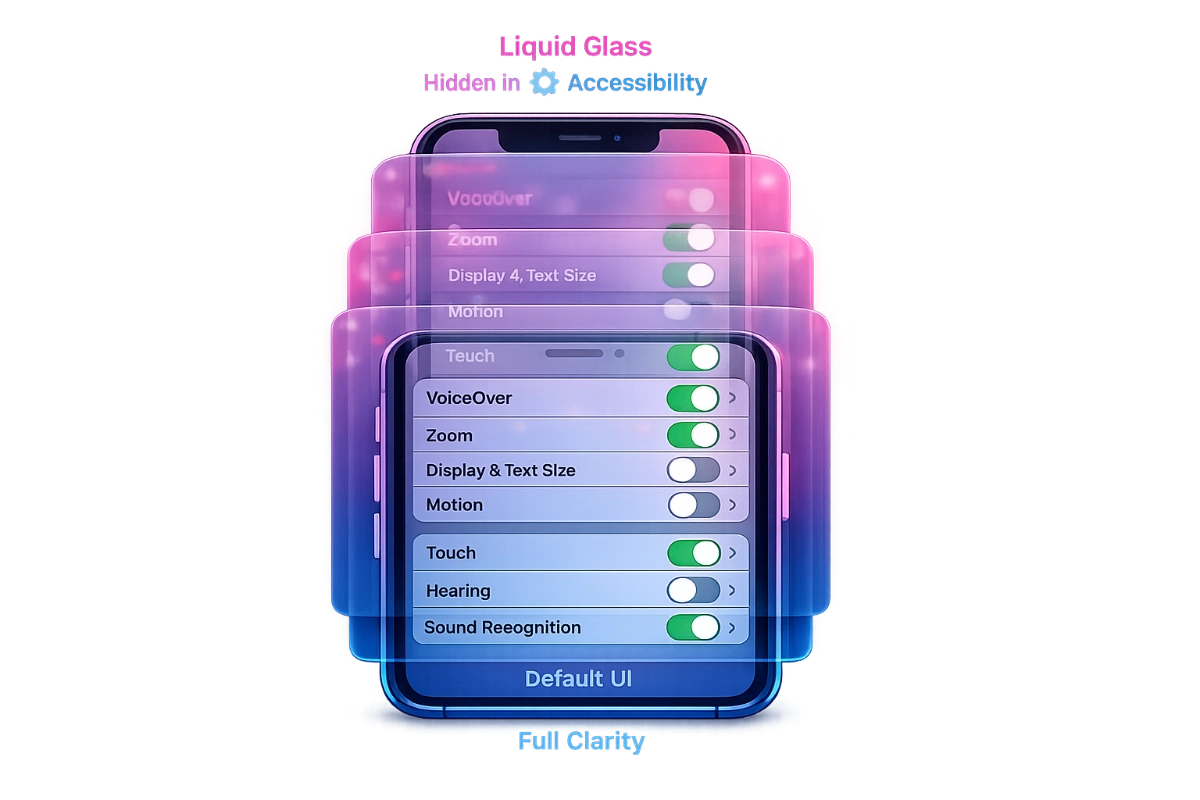
Apple's Liquid Glass interface launched with serious readability problems, but the company placed five powerful fixes in Accessibility settings where most users never look. Understanding how these controls interact reveals why millions struggle with an interface that has built-in solutions they don't know exist.
iOS 26 didn't just change how the interface looks. It changed how easy the interface is to read, and not in a direction most users would have chosen. Navigation bars, toolbars, notifications, and control overlays all use semi-transparent materials that blend with whatever content sits behind them. On a vivid wallpaper, text labels on translucent buttons can nearly disappear. The refraction shimmer that gives the design its name adds visual noise that some people process without noticing and others find genuinely disorienting. For users who need clear visual boundaries to work efficiently, the default implementation makes ordinary tasks harder than they were before.
UX researchers flagged specific failure modes quickly. One issue that surfaced in multiple expert analyses: interactive elements designed with translucent surfaces can look decorative rather than tappable, because the glass treatment removes the visual weight that signals "this is a button." In Apple Mail, translucent subject lines overlap with translucent background elements, creating what accessibility researchers call "text on text" conditions. Independent testing found that some Liquid Glass interface areas reached contrast ratios as low as 1.5:1, according to Infinum's early beta analysis. The Web Content Accessibility Guidelines set a minimum of 4.5:1 for standard text, not as a ceiling for compliance, but as a baseline for readability across the general population.
Apple built five settings that address every one of these problems. They are collected at Settings > Accessibility > Display & Text Size. For most users, that path is invisible: when a device is working correctly for you, you do not explore the Accessibility menu because the label implies it is for people who require disability accommodations. The settings are not filed there because they are specialized features. They are filed there because that is how Apple categorizes rendering-level display adjustments, regardless of how broadly useful those adjustments turn out to be.
The placement creates a systematic discovery barrier that has nothing to do with users missing obvious information. The label does the filtering. People who experience iOS 26 headaches, eye strain, or difficulty reading translucent labels search online for relief. They find these settings through articles or forum posts rather than by navigating their own device. The controls that address the problem are present at launch; the knowledge that they exist typically requires outside help to acquire.
Each of the five settings operates independently and targets a different aspect of the Liquid Glass design. Using them together compounds their effects, which is a feature rather than an accident, but understanding what each one does separately helps in choosing the right combination for your situation.
This is the highest-impact setting for most users. When turned on, it replaces the translucent glass materials on navigation bars, Control Center, notification panels, and app folders with more opaque backgrounds. The content behind those surfaces no longer bleeds through, which eliminates the primary source of text-against-background ambiguity. Reduce Transparency does not remove the iOS 26 aesthetic entirely; it makes translucent areas more opaque while keeping the rounded elements and updated layouts intact. When combined with Increase Contrast, the combined effect is stronger: MacRumors' how-to documentation confirmed that enabling both settings together causes app icons to lose most of their remaining translucency, producing something close to fully solid surfaces throughout the interface.
Reduce Transparency can also be added as an Accessibility Shortcut in Control Center, which allows toggling it on and off without navigating through Settings. For users who want the glass aesthetic most of the time but need to flip it off in bright light or on busy wallpapers, this shortcut makes the setting more practical than a buried toggle.
Where Reduce Transparency affects surface opacity, Increase Contrast sharpens the color difference between foreground elements and their backgrounds. Edges become more defined. Buttons stand out more distinctly from surrounding content. The two settings work on different rendering properties, which is why enabling both produces effects neither accomplishes alone.
Added in iOS 26.1 rather than at launch, Show Borders draws visible outlines around interface elements that would otherwise blend seamlessly into the glass background. Controls, buttons, and interface regions get defined edges. On iPhone, this helps distinguish interactive elements from decorative ones. On iPad, where multiple app windows can overlap in windowed multitasking, the benefit is more structural: window boundaries become unambiguous rather than a matter of visual inference.
This setting targets the liquid quality itself. The refraction and shimmer effects that animate as content shifts behind glass surfaces are eliminated. The interface still transitions between states, but the glass-like distortions that make the design feel alive are removed. For users whose difficulty with iOS 26 is primarily perceptual rather than legibility-based, Reduce Motion addresses something the other settings do not touch.
The subtlest of the five settings, Button Shapes adds visual indicators underlines, outlines, and shape markers to clickable elements that might otherwise appear as plain text. It addresses the tappability ambiguity problem at the element level rather than through broad opacity changes. Users who find the interface confusing about what is interactive but have no particular issue with the glass aesthetic will often find this setting solves their problem without affecting anything else.
All five are at Settings > Accessibility > Display & Text Size. For a faster route to the most impactful setting, open Settings, tap Search, and type "Reduce Transparency" to reach it directly on any iOS device.
iOS 26.1 added a second, more visible control: a Liquid Glass style toggle at Settings > Display & Brightness. It offers two options Clear, which preserves the default maximum transparency, and Tinted, which applies a frosted opacity that moderates the glass effect without eliminating it. The toggle is substantially easier to find than the Accessibility settings, and for users who want a single dial to turn down the glass intensity, it appears to be exactly what's needed.
There is a catch. Apple's own support documentation states that users who have enabled Reduce Transparency or Increase Contrast under Accessibility need to turn those settings off before the Liquid Glass toggle takes effect. The Accessibility settings override the newer toggle completely when active. Switching the Liquid Glass control from Clear to Tinted while Reduce Transparency is on produces no visible change. The interface offers no warning that this is happening.
The conflict reflects an architectural reality rather than an oversight. The Liquid Glass toggle was designed as a surface-level convenience layer added after user complaints mounted. The Accessibility settings operate at a lower rendering level that was built earlier and runs deeper. When both systems are active, the deeper system wins. The documentation acknowledges this in a brief note, but that note appears in a supplementary support article rather than at the point in Settings where the conflict actually occurs.
This creates two functional paths:
The aggressive clarity path uses Reduce Transparency, Increase Contrast, Show Borders, and Reduce Motion together. This combination strips most Liquid Glass visual complexity from the interface while keeping the iOS 26 layout, app organization, and rounded forms. It is incompatible with the Liquid Glass toggle; that toggle becomes non-functional while any of these Accessibility settings are on.
The moderate path uses the Liquid Glass toggle's Tinted option alone, potentially combined with Show Borders separately (which does not affect transparency levels). This preserves some glass materials and keeps the Liquid Glass toggle functional, at the cost of accepting weaker opacity reduction than the Accessibility settings provide.
Users who discover the Tinted toggle first, then later find Reduce Transparency and enable it for stronger effect, end up confused about why the toggle now does nothing. The conflict is neither a bug nor a temporary limitation. It is the current intended behavior, and understanding the hierarchy makes the choice between the two paths clearer.
For readers who want to explore the full scope of transparency controls introduced in iOS 26.2 including the Lock Screen clock slider and how it layers with the settings above iOS 26.2 Liquid Glass Settings: Hidden Controls That Fix Readability covers how to combine these newer per-element controls with Reduce Transparency for the most personalized result.
The five settings are available on iPhone and iPad, but the combination that delivers the most value differs by how each device is used.
On iPhone, Control Center and notification overlays are the most frequently encountered translucent surfaces. Reduce Transparency has the most immediate practical impact here because these panels appear constantly throughout the day. The combination of Reduce Transparency and Increase Contrast addresses the most common pain points without requiring a complete strip-down of the aesthetic. Show Borders adds value on smaller screens where button boundaries can be ambiguous.
iPad users with Split View and Stage Manager open multiple app windows simultaneously. Without Show Borders, overlapping translucent frames make it genuinely difficult to determine where one app ends and another begins. The setting's value on iPad is architectural: it resolves window boundary ambiguity rather than just improving button legibility. For iPad users doing anything involving multiple apps, Show Borders may be the most important of the five settings.
macOS Tahoe's implementation of these controls is inconsistent with its mobile counterparts in ways that matter. Show Borders is not available on macOS at all. More significantly, OSXDaily documented that Reduce Transparency was substantially non-functional in macOS Tahoe 26.1 and 26.2: the setting reduced transparency in the menu bar and Control Center, but transparency persisted in window title bars, sidebars, search bars, and Finder. Apple resolved the bug in macOS Tahoe 26.3.
Developer Tyler Hall created a free utility called Alan that addresses the missing Show Borders functionality. The app draws a customizable border around the active foreground window, making focus state immediately visible in an environment where high translucency makes it difficult to tell which window is currently active. The name is an ironic reference to Alan Dye, the Apple VP who led Liquid Glass's development. Border width and color are adjustable for both light and dark mode. For Mac users who upgraded to macOS Tahoe 26.1 or 26.2 and found Reduce Transparency seemingly doing nothing, the correct explanation is the bug, not a misconfigured setting; the fix arrived in 26.3.
The most common assumption about disabling Liquid Glass effects is that it should improve battery life. GPU-intensive effects require power; eliminating them should reduce consumption. The assumption is intuitive. It also appears to be incorrect on modern hardware.
MacRumors conducted a controlled four-round battery test on iPhone 17 Pro Max, comparing Clear, Tinted, Tinted with Reduce Transparency and Increase Contrast enabled, and Tinted with all four Accessibility settings enabled together. Each session ran for 2.5 hours under matched conditions starting from the same battery level. All four rounds ended within one percentage point of each other. The most aggressive accessibility combination and the default maximum-transparency mode consumed essentially identical amounts of power.
The technical explanation lies in where modern smartphones actually spend battery. On OLED displays, screen brightness is the dominant power consumer by a significant margin. GPU shader work for blur and refraction effects on supported hardware runs efficiently enough that the marginal cost is small relative to the display itself. Some speculation in the iOS developer community holds that Liquid Glass effects may continue to be rendered at the pipeline level even when the UI visually suppresses them, though this has not been confirmed.
The benefit users describe after enabling Reduce Transparency is real, but it is cognitive rather than electrical. When the visual environment stops requiring constant parsing of overlapping translucent layers, complex layouts process more easily, and the device subjectively feels more responsive. This is not a placebo effect; it is a genuine reduction in the visual interpretation work the brain performs in the background. The device isn't faster. Reading the interface is.
On older devices with A15 chips, no controlled battery test comparable to the MacRumors iPhone 17 Pro Max study has been published. User reports suggest performance on A15 hardware is broadly comparable to iOS 18 after the initial post-upgrade indexing period, but that is anecdotal rather than measured. The honest assessment is that battery savings from disabling Liquid Glass effects are, at best, marginal on any supported device, and appear to be immeasurable on the hardware where the most rigorous testing has been done.
To understand why five powerful readability controls are hidden inside an Accessibility menu rather than offered as first-class settings, it helps to understand what Apple does when a design decision faces sustained criticism.
The company's established pattern is not to change the default. It is to expand the opt-out surface area incrementally across point updates, starting with the controls most disruptive to the default aesthetic going into Accessibility, then adding weaker but more visible alternatives in later releases. iOS 7's parallax motion and transparency effects in 2013 generated significant complaints about motion sickness and readability. Apple's response was to add Reduce Motion and Increase Contrast to Accessibility in subsequent updates while keeping the iOS 7 aesthetic unchanged for everyone who didn't find and apply them. iOS 26 is the same sequence executed at larger scale.
iOS 26.1 added the Liquid Glass toggle to Display & Brightness. iOS 26.2 added a clock transparency slider accessible by long-pressing the Lock Screen and tapping Customize. Each update adds more granular control for users motivated to find and configure it. None changed what a freshly set up iPhone looks like.
This approach preserves Apple's ability to show the full Liquid Glass aesthetic in marketing materials, press reviews, and device comparisons, while providing genuine relief to users who find the defaults unusable — as long as those users know to look.
Alan Dye, the VP of Human Interface Design who led Liquid Glass's development, left Apple for Meta on December 3, 2025. Tim Cook's statement confirming the transition noted that his successor, Stephen Lemay, "has played a key role in the design of every major Apple interface since 1999." Lemay is described by people who have worked with him as prioritizing how design functions rather than how it looks. Apple employees' internal reaction to the news, according to AppleInsider citing Daring Fireball's reporting, included expressions of relief. Liquid Glass as a design language is not expected to be reversed; the infrastructure is too embedded for that. What the succession signals is a shift in priority ordering: functional craft before visual statement, at least at the leadership level.
The narrative that iOS 26 suffered historically low adoption rates turned out to be a measurement error. Apple's App Store data as of February 2026 showed 74% of iPhones released within the previous four years were running iOS 26, a pace broadly matching iOS 18 at the same point in its cycle. The early reports of dramatically suppressed adoption used StatCounter data that failed to account for iOS 26's browser fingerprinting protections, which made Safari traffic appear to belong to an older browser version. StatCounter acknowledged the methodology error.
It is not entirely clear whether placing the most powerful display controls in Accessibility reflects a deliberate decision to protect the default aesthetic from casual discovery, or whether it reflects how Apple's internal teams have historically classified rendering-level adjustments regardless of how broadly useful they are. The outcome is the same in either case: the users most affected by Liquid Glass's legibility problems are the least likely to find the settings that fix them, because the label on the door tells them the room is for someone else.
The five controls at Settings > Accessibility > Display & Text Size are not specialized accommodations. They are fundamental display settings that change how readable the interface is for everyone who needs clarity over aesthetics. Until Apple moves them to a more prominent location, or at minimum surfaces them to users who report eye strain through Siri or Settings search, the gap between the problem and the solution will remain wider than it needs to be.
Will enabling these settings affect app-specific designs or only Apple's own UI?
Reduce Transparency, Increase Contrast, and the other Display & Text Size settings affect system-level interface elements: navigation bars, toolbars, Control Center, notifications, and the Dock. Third-party apps that use Apple's standard UI components will reflect the changes; apps with fully custom interfaces may not. Show Borders and Button Shapes apply system-wide wherever Apple's standard controls appear.
Can I quickly toggle these settings without going back into the menu every time?
Yes. Accessibility Shortcut can be configured for any of these settings via Settings > Accessibility > Accessibility Shortcut, then added to Control Center for single-tap access. Alternatively, triple-clicking the side button activates the shortcut for whichever settings are assigned to it.
Does the Liquid Glass Tinted mode look noticeably different from Reduce Transparency?
The visual result is different rather than the same thing at different intensities. Tinted applies a frosted overlay with a slight color tint, preserving the overall glass aesthetic at reduced transparency. Reduce Transparency replaces translucent surfaces with solid or near-solid opaque backgrounds, which is a more complete departure from the glass look. Tinted keeps glass; Reduce Transparency removes it.
Does enabling these settings flag my device as having an accessibility need anywhere?
No. Enabling these settings stores a preference locally on the device. Nothing is reported to Apple or flagged in any account. The settings are stored the same way as display brightness or wallpaper preferences.