Finished reading? Continue your journey in Tech with these hand-picked guides and tutorials.
Boost your workflow with our browser-based tools
Share your expertise with our readers. TrueSolvers accepts in-depth, independently researched articles on technology, AI, and software development from qualified contributors.
TrueSolvers is an independent technology publisher with a professional editorial team. Every article is independently researched, sourced from primary documentation, and cross-checked before publication.
Apple's iOS 26.2 update added Lock Screen transparency controls, but the most powerful readability fixes already exist in accessibility settings most users ignore. Combining Reduce Transparency with Increase Contrast transforms the entire interface more dramatically than any toggle Apple promotes. Understanding which settings to adjust and how to layer multiple controls turns Liquid Glass from visual frustration into a genuinely personalized experience.
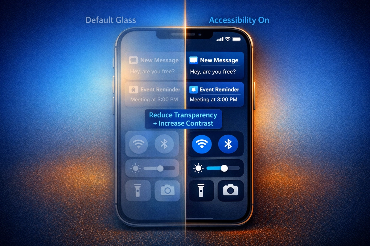
Liquid Glass applies semi-transparent, light-refracting materials across the iPhone interface: buttons, notifications, Control Center panels, and the Lock Screen clock all use layers that shift and reflect whatever sits behind them. On a muted, low-contrast wallpaper, that approach works. On a photograph with varied tones, bright regions, or complex textures, the interface can become functionally invisible.
The problem isn't subjective. Independent accessibility testing by Infinum measured some default Liquid Glass screens at a 1.5:1 contrast ratio in early builds. The Web Content Accessibility Guidelines set the minimum at 4.5:1 for normal text. That isn't a minor shortfall; it's a gap that crosses the line between "slightly harder to read" and "effectively illegible" for many users in ordinary conditions.
Ordinary conditions matter here. Accessibility challenges don't require a diagnosed impairment. Bright sunlight, a cracked screen, aging eyes, or simply a high-contrast wallpaper photo recreate the same reading difficulties as a low-vision condition. Apple designed Liquid Glass for ideal display environments; most iPhones spend their lives outside of those.
Apple's attention to front-panel legibility extends beyond software. The iPhone 18 Pro's under-display camera represents the hardware complement to these software transparency controls, shrinking the Dynamic Island by moving Face ID sensors beneath the display to deliver the cleanest front panel the iPhone has shipped. Software readability settings and hardware display design are evolving on parallel tracks.
iOS 26 shipped with this as the default, and Apple has been adding controls ever since: Tinted mode in iOS 26.1, a granular Lock Screen slider in iOS 26.2. Our research into user reports and accessibility audits confirms that the fastest and most comprehensive relief doesn't come from either of those additions. It comes from settings that have been in iOS all along, just placed where most users never look.
Before adjusting anything, there's an architectural decision that most guides skip: two separate paths exist for managing Liquid Glass transparency, and they cannot be used at the same time.
The first path runs through Settings, then Display & Brightness, then Liquid Glass. There, Apple offers a binary choice between Clear (the original high-transparency default) and Tinted. Tinted mode increases the opacity of translucent elements and applies a color wash that pulls tones from your wallpaper, making buttons and notifications feel more cohesive and less like floating glass. This is the consumer-facing route: easy to find, moderate in impact, and reversible in two taps.
The second path runs through Settings, then Accessibility, then Display & Text Size. Reduce Transparency sits here, alongside Increase Contrast and several other controls. These settings predate Liquid Glass by years and were built for users who need consistent legibility across all conditions. Enabling Reduce Transparency adds darker, more opaque backgrounds to translucent areas throughout the entire interface, producing a more dramatic change than Tinted mode.
Here is the constraint that changes everything: Tinted mode requires Reduce Transparency to be turned off. Apple enforces this dependency at the interface level. The Liquid Glass toggle under Display & Brightness becomes unavailable when Reduce Transparency is active. Users who want to layer both, expecting compounded opacity, will find that the accessibility setting takes precedence and the Tinted option disappears.
Tinted mode was placed in the obvious consumer location to serve users wanting minor aesthetic softening. Reduce Transparency was left in the Accessibility menu to serve users needing comprehensive legibility intervention. Apple confirmed to TechCrunch that beta tester feedback drove the Tinted mode addition in iOS 26.1. These aren't two layers of the same setting; they reflect different assumed needs from the start. Choosing which to use isn't a matter of personal preference; it depends on how much the default interface is actually interfering with reading.
A practical rule follows from this structure: if you find yourself squinting, adjusting viewing angles, or regularly missing notifications because text doesn't stand out from the wallpaper, the Accessibility path will serve you better. If you simply want slightly more visual weight on buttons and panels while keeping the glass aesthetic intact, Tinted mode is sufficient.
Navigate to Settings, then Accessibility, then Display & Text Size. Reduce Transparency is the first toggle in the list. Enable it, and the change is immediate: Control Center, app icons, folders, and system panels gain opaque or near-opaque backgrounds where translucent glass previously sat. The rounded shapes and design language of iOS 26 remain intact; only the see-through quality disappears.
This setting doesn't require the iPhone to be in any special mode and applies instantly without a restart. If you find the change too aggressive for everyday use, adding it to Accessibility Shortcuts makes toggling it a triple-click rather than a Settings dive.
To set that up: Settings, then Accessibility, then Accessibility Shortcut at the bottom of the menu. Select Reduce Transparency from the list. Then open Control Center settings and add the Accessibility Shortcuts button. From that point, a triple-click on the side button activates or deactivates Reduce Transparency, and the Control Center button provides the same toggle alongside brightness and volume.
Increase Contrast lives in the same Display & Text Size menu as Reduce Transparency. It sharpens the distinction between foreground elements and their backgrounds by intensifying color separation at the edges of buttons, text, and icons.
The two settings address different dimensions of the same problem. Reduce Transparency handles opacity: it prevents the interface from becoming see-through. Increase Contrast handles edge definition: it ensures foreground elements don't blend at their boundaries with whatever is behind them. Together, they remove most translucency from icons and system elements while maintaining the rounded, contemporary feel of iOS 26. The interface after enabling both looks closer to iOS 18's legibility without resembling iOS 18's visual language.
Reduce Motion lives in Settings, then Accessibility, then Motion. It disables the parallax shift that makes the Lock Screen wallpaper slide beneath icons, the fluid morphing animations in transitions, and the dynamic lighting effects that cause some elements to appear to pulse or shift. This setting addresses a different readability problem: not contrast, but visual stability. Users who find the moving background distracting during text-heavy use or who experience motion sensitivity will benefit from enabling it. For everyone else, it's optional. Reduce Transparency and Increase Contrast handle contrast legibility; Reduce Motion handles perceptual distraction.
Confirm Reduce Transparency is turned off before proceeding. Then open Settings, then Display & Brightness. The Liquid Glass section shows two options: Clear and Tinted. Tap Tinted. A preview appears immediately so you can see the change on your current wallpaper before committing. If the result looks right, leave the menu. If you want to return to the original appearance, tap Clear.
Tinted mode applies a color overlay to translucent system elements that matches your wallpaper's dominant tones. Instead of glass that floats over the background as a neutral layer, panels and buttons take on a tint drawn from the image behind them. This creates a more unified look than the default Clear setting while adding meaningful opacity.
Tinted represents a genuine middle ground rather than a compromise, but the distinction between two user frustrations matters here. For users whose primary frustration is the aesthetic disconnect between interface and wallpaper, Tinted resolves it. For users whose primary frustration is difficulty reading text on transparent panels, Tinted may not be enough. The Clear option, which sits alongside Tinted, pushes transparency beyond the default level. Most users find this reduces usability rather than improving it, but it exists for those working with wallpapers that naturally provide high contrast regardless of what overlays them.
Apple added the Lock Screen clock transparency slider in iOS 26.2, significantly expanding the range from earlier versions where a slider existed but produced minimal visible change. The expanded slider now runs from very transparent to nearly opaque, giving fine control over exactly how much the clock blends with or stands out from the wallpaper.
To access it: long-press the Lock Screen wallpaper until the customization menu appears, then tap Customize, then tap directly on the clock display. The transparency slider appears below the font selection row. Alternatively, navigate to Settings, then Wallpaper, then tap Customize on the Lock Screen thumbnail.
The same screen offers the Glass and Solid choice. Solid abandons transparency entirely for the clock, ensuring legibility regardless of wallpaper content or lighting. If a particular wallpaper makes the clock unreadable even at the slider's most opaque setting, switching to Solid is the guaranteed fix.
Apple hasn't officially documented which wallpaper types cause the transparency slider setting to reset. What we gathered from Apple Community threads identifies a consistent pattern: dynamic wallpapers and Live Photos rebuild themselves each time the Lock Screen exits, and that rebuild process overwrites any custom transparency setting you applied. Switching to a static image before adjusting the slider preserves the setting reliably.
This is the most common reason users believe the slider simply doesn't work. It works; the wallpaper category is the variable.
One additional limitation worth knowing: the slider only affects the Lock Screen clock. Other Liquid Glass elements, including notifications, media controls, and the home screen, require either the system-wide Tinted mode or the Accessibility path. The iOS 26.2 slider provides surgical control over the most prominent readable element on the Lock Screen; it is not a global transparency adjustment.
Most coverage of Liquid Glass readability stops at transparency settings and treats them as the complete solution. A second layer of legibility improvements works independently of whichever transparency path you chose, and most users never enable them.
Bold Text lives in Settings, then Accessibility, then Display & Text Size. It thickens every text element throughout the system: menus, labels, app names, notification previews. This change requires a restart to apply, but it works on top of any transparency configuration. Larger Text sits in the same menu and adjusts a global size slider that scales text throughout iOS and supporting apps simultaneously.
The Home Screen offers its own legibility tools. Long-press any empty area on the Home Screen, then tap Edit, then Customize. The panel that appears includes options for darkening the Home Screen icon backgrounds and dimming the wallpaper behind them. These adjustments sit entirely outside the transparency and accessibility menus and don't interact with Tinted mode or Reduce Transparency. On wallpapers where icon labels disappear into a busy background regardless of contrast settings, darkening the Home Screen layer is often the most direct fix.
None of these settings require committing to a single approach. Bold Text combines with Reduce Transparency. Larger Text combines with Tinted mode. Home Screen darkening works regardless of what's enabled elsewhere. The complete legibility stack uses multiple layers because the readability problem has multiple dimensions.
A frequently repeated claim holds that enabling Reduce Transparency and Reduce Motion saves meaningful battery life by reducing GPU workload. The logic is sound. The evidence for current hardware is not.
MacRumors conducted four battery test scenarios on iPhone 17 Pro Max, comparing Clear mode, Tinted mode, Tinted plus Reduce Transparency and Increase Contrast, and all three settings plus Reduce Motion. Each test started at 80% charge and ran for 2.5 hours. All four scenarios finished at 69-70%. No meaningful differentiation appeared. On current-generation hardware, Apple's modern chips process the rendering demands of animated glass surfaces and motion-reactive layers without any measurable cost to the battery. Disabling those effects produces no detectable difference in charge consumption.
The meaningful battery benefit belongs almost entirely to users on iPhone 11 through iPhone 14. The older chips in those devices face a genuine computational cost from rendering Liquid Glass effects, and users on those models consistently report improved responsiveness and reduced drain after enabling Reduce Transparency and Reduce Motion. The claim has a factual basis; it simply doesn't apply to the iPhone models most current users are running. For anyone on iPhone 15 or newer, enabling these settings improves readability. Expecting them to extend battery life sets up a disappointment. Low Power Mode, Dark Mode, and reducing screen brightness remain the effective battery tools on modern hardware.
The pace of these additions reflects deliberate course correction at Apple. The company confirmed that beta tester feedback drove the Tinted mode inclusion in iOS 26.1. The design leadership change is equally telling: Apple announced in December 2025 that Stephen Lemay succeeded Alan Dye, with Tim Cook noting that Lemay "has played a key role in the design of every major Apple interface since 1999." Three consecutive updates adding user-requested readability controls, paired with a transition to a long-tenured interface designer, suggests Apple is adjusting its course on Liquid Glass rather than defending the original configuration. More granular per-element controls in future updates would follow the pattern already established.
Can I use Tinted mode and Reduce Transparency at the same time?
No. Tinted mode requires Reduce Transparency to be turned off. When Reduce Transparency is active, the Liquid Glass toggle under Display & Brightness becomes unavailable. These are two separate approaches to the same problem, not two layers of the same solution. If you need the most comprehensive legibility improvement, use Reduce Transparency. If you want a lighter adjustment that preserves more of the glass aesthetic, turn Reduce Transparency off and use Tinted mode.
Why does my Lock Screen transparency slider keep resetting?
Dynamic wallpapers and Live Photos rebuild themselves when the Lock Screen exits, which can overwrite saved transparency settings. Switching to a static image wallpaper before adjusting the slider preserves the setting. Apple hasn't documented this behavior officially; the pattern surfaces consistently in Apple Community threads but has no official fix beyond the wallpaper workaround.
Which iPhone models actually benefit from enabling Reduce Motion for battery life?
The meaningful battery benefit is concentrated in iPhone 11 through iPhone 14. Older chips in those devices bear a real computational cost from Liquid Glass animations, and users on those models report improved battery and responsiveness after enabling both Reduce Transparency and Reduce Motion. On iPhone 15 and newer, MacRumors four-scenario testing found no measurable battery difference between full transparency and all three settings enabled simultaneously.
Does the iOS 26.2 Lock Screen slider fix readability throughout the whole interface?
No. The slider only controls the Lock Screen clock. For everything else, including notifications, Control Center, and Home Screen panels, you need either the Tinted mode toggle in Display & Brightness or the Reduce Transparency setting in Accessibility. The slider provides precise aesthetic control over the clock specifically; it isn't a substitute for the system-wide options.
What's the fastest way to toggle these settings without navigating through Settings every time?
Add Reduce Transparency to Accessibility Shortcuts: Settings, then Accessibility, then Accessibility Shortcut at the bottom of the menu. Select Reduce Transparency. Then add the Accessibility Shortcuts button to Control Center. A triple-click on the side button will activate or deactivate the setting instantly, and the Control Center button provides the same toggle from anywhere. This makes Reduce Transparency an environmental switch rather than a permanent configuration choice.