Finished reading? Continue your journey in Tech with these hand-picked guides and tutorials.
Boost your workflow with our browser-based tools
Share your expertise with our readers. TrueSolvers accepts in-depth, independently researched articles on technology, AI, and software development from qualified contributors.
TrueSolvers is an independent technology publisher with a professional editorial team. Every article is independently researched, sourced from primary documentation, and cross-checked before publication.
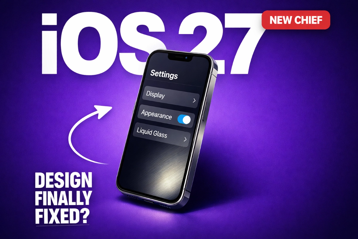
Apple is planning interface tweaks for iOS 27, and they'll be more meaningful than the description "tweaks" implies. Not because the changes will be dramatic. But because whoever shapes them now operates with a fundamentally different design philosophy than the person who shaped Liquid Glass. That shift in thinking matters more than any single UI adjustment Apple might make.
Liquid Glass made iOS 26 look unmistakably new, and understanding what it actually did to usability is where any honest assessment of iOS 27 design changes has to start. The translucent, refracting elements across navigation bars, tab bars, and system controls carried real visual ambition, borrowed from the spatial computing work behind Vision Pro and applied to a flat phone screen. The result photographed beautifully. Using it across a full day was a different experience entirely, and the problems it introduced are not abstract. They are documented, specific, and now sitting on nearly three-quarters of active iPhones.
Nielsen Norman Group, the most authoritative UX research organization working in this field, documented the functional regressions after analyzing iOS 26. Touch targets in Photos shrank compared to iOS 18, falling below the minimum tap area sizes specified in Apple's own Human Interface Guidelines. In the Music app, the song title animates like a stock ticker and physically repositions itself when the tab bar shifts during scroll. In Mail, translucent layers stack on each other in ways that put text over text, turning routine email reading into a legibility exercise. Safari's floating controls compete for attention with whatever content sits below them. These aren't aesthetic complaints. They're functional regressions cases where an interface made routine tasks measurably harder.
For readers living with those problems now, Apple quietly placed several of the most effective fixes in Accessibility settings where most users never look a workaround worth knowing while iOS 27 takes shape.
A controlled test by In Depth Tech Reviews compared two iPhone 16 Pro Max units through 150 repetitions of four standard daily interactions: pulling notification center, opening and closing Safari, scrolling through Photos, and unlocking. Both devices started at 80% charge under identical conditions. The iOS 26 device lost 13% battery completing those cycles. The iOS 18 device lost 1%. Apple acknowledged a temporary impact on battery life and thermal performance following the update, though the company attributed it to general post-update behavior rather than Liquid Glass rendering specifically.
The scale of who lives with these problems matters. Early reports suggested iOS 26 adoption was catastrophically low, with one widely-cited figure placing it near 15%. That number was wrong. Safari 26 deliberately misreports the iOS version in browser user-agent strings to prevent advertiser fingerprinting, causing third-party analytics to miscount iOS 26 devices as iOS 16 devices. Apple's own App Store transaction data tells an accurate story: as of February 12, 2026, 74% of iPhones introduced in the last four years were running iOS 26. That figure is slightly behind where iOS 18 adoption stood at a comparable stage, but the gap narrows considerably when accounting for the 23 additional days iOS 26 had to accumulate.
Nearly three-quarters of recent iPhones are running these behaviors right now.
iOS 26's failures share a through-line that isn't aesthetic. Controls that disappear at the wrong moment, animations that run continuously without communicating state, touch targets sized for screenshots rather than actual fingers, these don't distribute randomly. They cluster. The pattern points toward a specific root cause: a design process that evaluated what shipped rather than what was used, and what looked right rather than what cost the user something across the tenth and hundredth repetition.
Alan Dye joined Apple in 2006 through the Marketing Communications team. He moved into interface design leadership from there, becoming VP of Human Interface Design in 2015. His pre-Apple career included work at Kate Spade and Ogilvy, both brand and communications roles. That path matters because brand design and interaction design ask fundamentally different questions.
Brand design asks: does this communicate the right identity? Does it photograph correctly? Interaction design asks: does this perform correctly across the hundredth habitual use by someone with slightly imprecise fingers and divided attention? A button that looks perfect in a press screenshot can be genuinely maddening to hit reliably in practice. These disciplines require different training and, more importantly, different instincts about what constitutes a problem worth solving.
John Gruber at Daring Fireball reported that sources described Dye's inner circle treating standard interaction design terminology as "programmer talk." That single detail captures the cultural gap more precisely than any biography could. When the people leading Apple's largest design organization dismiss the vocabulary of the discipline they're supposed to be practicing, the output optimizes for what that leadership understands visual presentation and away from what it doesn't: habitual use, spatial memory, and the cost of disrupted learned behavior. Gruber also noted that everyone he spoke to at Apple was "if not downright giddy" at the news of the transition.
The controls that disappear during search, the animations that run without purpose, the tap targets that shrank, these are not a random collection of oversights. Each represents a decision that would have registered as a problem earlier in the development process if the evaluating instinct were "how does this feel across a hundred uses?" rather than "how does this look in the demo?" The failures are the signature of a specific kind of leadership mismatch. Not incompetence. A mismatch of discipline.
Tim Cook's statement accompanying Lemay's expanded appointment was specific in a way these announcements rarely are: "Steve Lemay has played a key role in the design of every major Apple interface since 1999." Lemay joined Apple that same year, worked on the original iPhone interface team alongside Imran Chaudhri, Bas Ording, Mike Matas, and Marcel Van Os, and spent his entire Apple tenure as a software interaction designer. His patent portfolio on Justia runs 53 pages, including the iPhone's foundational interaction patent, US 8,570,278 B2. These aren't decorative contributions. They're the mechanics that made touch computing feel intuitive rather than learned.
His design philosophy has a clean expression in the Apple Pencil Pro's shadow. When asked about the shadow's purpose, Lemay explained it was designed to help users cognitively feel that they were holding a physical pencil, not just sliding a stylus across glass. The shadow was not decorative. It was a cognitive bridge between the tool's digital behavior and the user's physical expectations the sensation of the thing serving the function of the thing, neither one subordinate to the other.
That orientation is almost exactly the inverse of what iOS 26 expressed. The Music app's ticking song title is motion that disrupts rather than communicates. The toggle animation turns an ephemeral interaction into a visual event that demands attention. These are sensation without function the direct opposite of the design commitment the Pencil Pro shadow represents.
Apple employees essentially never speak publicly about internal personnel transitions. Ben Hylak, a former colleague, described Lemay as the best designer he had ever met or worked with. Dorian Dargan called him a "generational talent" who "doesn't stop until things are simple and intuitive." Chan Karunamuni, who has worked under Lemay for 15 years, expressed the same conviction. The volume and specificity of that reception is a signal in itself. These are not promotional statements. They are people who know the work expressing what the arrival of a specific kind of leadership means to the quality of what gets built.
The most important framing for iOS 27's design direction is the one that Bloomberg's Mark Gurman has been explicit about: Liquid Glass was not Alan Dye's personal project. MacRumors, citing Gurman's Bloomberg reporting, confirmed Apple's internal position that Liquid Glass was a collective institutional decision the design direction was not Dye's alone, and the company's commitment to it has not wavered. Lemay inherits a design system he didn't create. What iOS 27 offers instead is the first release where his expanded authority and interaction-first instincts can express themselves in shipped product.
MacRumors, citing Gurman's Bloomberg reporting, confirmed that iOS 27, internally codenamed "Rave," includes planned interface tweaks but Gurman characterized them as nothing approaching the scale of last year's Liquid Glass introduction. The Snow Leopard parallel that circulates through coverage of this release is accurate: Apple's 2009 Mac OS update prioritized cleanup, reliability, and efficiency over new capabilities. Nobody could point to a specific feature it added. The Mac simply worked better. iOS 27 is structured around the same mandate.
The pattern of correction is already visible in Apple's point releases. iOS 26.1 added a system-wide transparency toggle for Liquid Glass elements, and iOS 26.2 extended that to granular per-element controls for the lock screen clock documented in the same reporting that carries Gurman's account of Apple's institutional commitment to the design language. These are functionally escape hatches: Apple shipped visible remediation in response to real user feedback.
Apple shipped visible remediation a system-wide transparency toggle in iOS 26.1, granular per-element controls in iOS 26.2 before Lemay's appointment formally expanded. The internal case for usability correction was strong enough to produce that remediation on its own. The contingent inside Apple that treats interaction quality as non-negotiable was not created by this transition. It existed. What changes with Lemay's leadership is that contingent now has a design chief whose formation and instincts align with theirs rather than working against them. He accelerates an internal correction that was already in motion.
That structural context matters for how to read iOS 27's tweaks. Persistent tab bars that don't collapse during search activation, navigation controls stable enough to support reliable muscle memory, touch targets that meet the size specifications Apple set for itself in its own guidelines none of these require abandoning translucency or glass rendering. Every major usability problem Nielsen Norman Group documented is correctable within the Liquid Glass visual framework. The aesthetic survives. What gets fixed is the behavior underneath it.
iOS 27's design tweaks don't exist in isolation. The code cleanup mandate is equally important. Gurman described iOS internals as "a bit of a mess under the hood" and characterized the release as focused on removing outdated code fragments, rewriting older features in more efficient forms, and upgrading apps for improved performance. MacRumors, citing Gurman's Bloomberg reporting, noted that Apple is weighing whether to actively market the expected battery efficiency gains or allow users to discover them organically.
The hardware context reinforces why this cleanup matters beyond aesthetics. A foldable iPhone and a touchscreen MacBook Pro are both expected to arrive in late 2026. Both require a stable, efficient platform as their foundation. When new hardware form factors depend on iOS as their base layer, the institutional incentive to prioritize reliability over spectacle is not just philosophical it's structural. Apple cannot afford an iOS 27 that ships with the same class of behavioral problems that Liquid Glass introduced.
iOS 27's significance won't show up neatly in a keynote slide. Twenty-six years of foundational design work suggests Lemay's interaction-first philosophy is deeply embedded and if it is, the improvements may land the way Snow Leopard improvements landed: not as features anyone can name, but as a general sense that the iPhone feels more trustworthy. Navigation controls that stay where you expect. Tap targets you hit on the first attempt. Animations that stop when they've communicated their point. That kind of improvement doesn't make a headline. It shows up six months later in how people describe whether they trust their phone.
What iOS 27's specific design decisions will be remains unannounced. Whether Lemay's authority extended fully to this cycle's development or whether much was already set before his appointment expanded is something that cannot be confirmed from outside Apple. What the structure of this release does confirm is that every external pressure points in the same direction: toward reliability, toward behavioral correction, toward the class of problems that an interaction designer trained on touch primitives and the original iPhone has spent a career learning to prevent.
That's not a guarantee. It's an alignment. And for the first time in some years at Apple's design organization, the alignment runs all the way to the top.