Finished reading? Continue your journey in Tech with these hand-picked guides and tutorials.
Share your expertise with our readers. TrueSolvers accepts in-depth, independently researched articles on technology, AI, and software development from qualified contributors.
TrueSolvers is an independent technology publisher with a professional editorial team. Every article is independently researched, sourced from primary documentation, and cross-checked before publication.
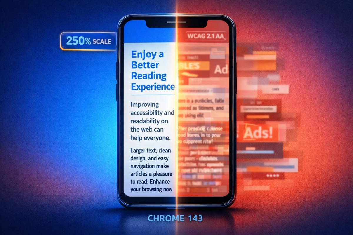
Chrome 143 for Android transforms Reading Mode from an unreliable convenience into a genuine accessibility tool. Google moved the feature from inconsistent automatic detection to permanent menu access, added text scaling up to 250%, and made preferences persist across every page you visit. These changes directly address WCAG accessibility standards while solving the mobile reading problems that make users abandon articles within 10 seconds.
Chrome's original Reading Mode design created a specific kind of frustration: you never knew if it would be there. A small icon appeared in the address bar when Chrome's internal algorithms decided a page qualified as an article, and disappeared just as quickly when those algorithms changed their minds. Open the same page twice under slightly different conditions, and the icon might not reappear. The feature existed, but its availability was never in your control.
That uncertainty matters differently depending on why you need it. For casual readers, a missing icon is a minor inconvenience. For someone with low vision, dyslexia, or light sensitivity, a reading tool that appears and disappears unpredictably is a tool you eventually stop trying to use.
Reporters at separate outlets, covering the old design independently, landed on the same three words without coordinating: "inconsistent," "random," "hit or miss." That kind of convergence isn't a framing choice; it reflects a documented failure that users and journalists encountered repeatedly. Google's response was architectural. Rather than improving the detection algorithm, the redesign removes detection as the gating mechanism entirely.
"Show Reading mode" now lives permanently in Chrome's three-dot overflow menu, directly below "Listen to this page," on every page you visit regardless of content type. The decision to activate the feature now belongs to you. 9to5Google confirmed the wide rollout as of February 28, 2026, noting that Chrome 145 is the version most users are encountering the redesign on, though a server-side component means the timing varies by device.
This is a deliberate design philosophy, not a compromise. Automatic detection, the approach Safari and Firefox use, surfaces reading modes for users who don't know to look for them. Manual activation serves users who already know they need it. For accessibility users who depend on simplified layouts, larger text, or adjusted contrast, guaranteed access is more valuable than algorithmic convenience. The trade is discoverability for reliability. Google chose reliability.
Once Chrome's Reading Mode activates, three categories of customization become available: text size, font choice, and background color. Each category has a specific accessibility rationale behind it.
Text scaling runs from 50% to 250% across seven stops. The practical ceiling matters here. WCAG 2.1 Success Criterion 1.4.4 requires that text be resizable to 200% without loss of content or functionality, and critically, this resizing must work without requiring assistive technology; the browser itself must provide the mechanism. Chrome's 250% maximum clears that mandatory floor by 50 percentage points, extending coverage to users with moderate vision impairment who need more than the standard legally compliant threshold. The single-column Reading Mode layout also satisfies WCAG 1.4.10 (Reflow), which requires content to remain readable without horizontal scrolling at high zoom levels, a requirement that standard browser zoom frequently fails on complex pages.
Font selection is where the recent version makes its clearest accessibility statement. The options are Sans Serif, Serif, Mono, and Lexend. The first three are familiar display choices serving different aesthetic preferences and reading contexts. Lexend is listed as the fourth option in Android Headlines' coverage of the Chrome 145 rollout, and it represents a meaningfully different kind of addition.
Sans Serif, Serif, and Mono are familiar display choices serving different aesthetic preferences and reading contexts. Lexend is different in kind. The font was built around reading proficiency research, with spacing and character proportions designed to lower the perceptual effort required to decode individual letters — which matters most for readers who struggle with character recognition, including those with dyslexia. Its inclusion alongside three conventional options suggests Google is thinking about Reading Mode as an accessibility tool rather than just a display preference.
The three color themes serve distinct needs. Light mode uses slightly off-white backgrounds and dark gray text rather than pure black on pure white, a softer contrast that reduces eye fatigue across extended reading sessions. Sepia shifts to warm brown tones on a cream background, reducing blue light for users who read before sleep. Dark mode delivers high-contrast light text on near-black backgrounds, reducing screen glare for light-sensitive users and low-light environments. All three modes are designed to meet the contrast requirements specified in Material 3 Expressive's design framework, which sets a 4.5:1 ratio for standard text.
The least flashy change in the Reading Mode redesign is the one that may matter most to the people who need it: your settings save.
Choose a font size, a font, and a color theme once, and Chrome stores those preferences across every page you visit, every session, permanently. Open a news article tomorrow, a Wikipedia page next week, a recipe site next month: your configuration is already there.
The friction of re-configuration falls hardest on the users who benefit most from the feature — and that's exactly the problem persistent preferences solve. Someone with a motor impairment finds repeated small interactions exhausting in ways that don't register for other users. Someone with cognitive fatigue can't reliably reconstruct a custom configuration across multiple sessions. When accessibility tools behave like tools that require you to demonstrate your need each time you use them, adoption stops. The feature gets tried once and abandoned.
Persistent preferences solve this by establishing a personal baseline. The user configures Reading Mode once and stops thinking about configuration. The font is always Lexend. The text is always 150%. The background is always Dark. From that point forward, activating Reading Mode on any page immediately delivers a readable experience built around their actual needs, with no additional steps.
This transforms Reading Mode from a feature that appears in a product announcement into a tool that accessibility users can genuinely depend on.
The customization panel in the redesigned Reading Mode appears as a bottom sheet, a panel that rises from the bottom of the screen. This placement follows from Material 3 Expressive, Google's current design system, which specifies that interactive elements on mobile should be positioned within natural thumb reach during one-handed use. A panel at the bottom of the screen is reachable without repositioning your grip. A top menu is not.
Material 3 Expressive mandates minimum touch targets of 48 by 48 density-independent pixels for all interactive elements, ensuring controls remain tappable for users with reduced fine motor control. It specifies contrast ratios at the system level rather than leaving them to individual product teams. Reading Mode's accessibility guarantees aren't all the product of Chrome-specific engineering decisions — they're partly inherited from those framework-level requirements. When Chrome adopts M3 Expressive, those requirements come along automatically.
Material 3 Expressive's specifications are grounded in 46 research studies with more than 18,000 participants, which found that expressive design is more usable across all age groups, not just younger users. The research confirmed that older users could identify key interactive elements as quickly as younger users across tested applications. For a reading accessibility feature whose target audience skews toward older users and users with visual or cognitive challenges, that finding is directly relevant.
The bottom sheet also keeps the address bar visible throughout the Reading Mode session. The previous design shifted to a full-screen takeover that obscured browser context. Retaining the address bar means users always know where they are and can navigate without dismissing the simplified view. An exit button provides immediate return to the standard page without requiring a back gesture or navigation step.
Safari Reader View and Firefox Reader View both use automatic detection. An icon appears in the address bar when the browser's algorithms determine the current page contains article-like content. When the algorithms are right, the icon appears and the user taps it. When the algorithms are wrong or uncertain, the icon doesn't appear at all, and Reading Mode is simply unavailable on that page.
Edge's Immersive Reader takes a different direction entirely, adding syllable breaks, line focus controls, and grammar markup tools designed for language learning and reading instruction. It targets an educational use case more than a pure reading accessibility one.
The relevant question isn't which browser detects more articles correctly; it's which browser's philosophy serves which types of readers. Safari and Firefox's automatic model works well for users who discover reading modes incidentally and use them occasionally — they don't need to know the feature exists; the browser surfaces it when conditions are right. Chrome's manual model works better for users who know they need the feature and want to know it will always be there. The availability is guaranteed. If a page can be simplified, it will be. If it can't, Chrome tells you explicitly rather than leaving the menu item absent.
That distinction shapes who benefits from each approach. Casual readers get more value from automatic detection. Accessibility users, frequent mobile readers, and anyone who has configured their preferences for a specific vision or reading need gets more value from guaranteed availability.
Open Chrome on Android and navigate to any page. Tap the three-dot overflow menu in the top-right corner and scroll down until you see "Show Reading mode," listed directly below "Listen to this page." Tap it. The page immediately converts to a simplified single-column layout, with the customization bottom sheet appearing for first-time users.
If a page doesn't support simplification, Chrome shows a "Reading mode is unavailable" notification rather than silently keeping the menu item grayed out. Highly dynamic single-page applications, image-heavy galleries, and interactive tools are the most common cases where this appears. Standard news articles, long-form journalism, Wikipedia pages, and recipe sites all convert reliably. For document-heavy reading tasks on mobile, such as reviewing formatted files or multi-section reports, pairing Reading Mode with purpose-built document tools makes sense; if you use Apple devices alongside Android, iOS 26's Preview app now handles mobile document editing with the same text flow precision as its desktop counterpart, covering the gap Reading Mode leaves with structured file formats.
The bottom sheet presents three control categories: font, text size, and background color. Select your preferred font from Sans Serif, Serif, Mono, and Lexend. Adjust text size across the seven stops between 50% and 250%. Choose Light, Sepia, or Dark for your background color. Chrome saves all three settings immediately. Every future Reading Mode activation on every page will open with those preferences already applied.
Chrome 145 is the version where most users encounter the redesigned Reading Mode in the stable channel without needing to enable any flags. Because there's a server-side component to the rollout, the timing will vary by device even within the same Chrome version. Users on Android 9 or higher are eligible for the feature; the minimum Android version requirement is Android 9, not Android 8.0 as some earlier documentation suggested.
Tap the exit button in the top-right corner of Reading Mode to return to the standard page immediately. Reading Mode does not alter the original page in any way; the standard view is exactly as you left it.
Can I use Chrome Reading Mode on desktop or only on Android? The redesigned Reading Mode with persistent preferences and the Material 3 Expressive bottom sheet is specific to Chrome for Android. Chrome on desktop has a separate flag-based reading experience that remains experimental and is not part of this redesign.
What happens if Reading Mode doesn't work on a page I need it for? Chrome shows a "Reading mode is unavailable" pop-up when a page can't be simplified. This typically happens on JavaScript-heavy single-page applications, interactive tools, and pages with minimal text content. For those pages, Chrome's Page Zoom, which increases text size without breaking page layout, may serve as an alternative.
Do I need to update to Chrome 145 specifically to see the new Reading Mode? Chrome 145 is the version associated with the broad rollout, but the feature has a server-side component, which means two devices on the same Chrome version may see the rollout at different times. If you're on Chrome 143 or later and don't see the redesign, waiting for the server-side flag to activate for your device is the most reliable path; the experimental chrome://flags/#reader-mode-improvements flag may also work on earlier versions.
What is the minimum Android version required? Chrome Reading Mode requires Android 9 (API level 28) or higher.
Does Reading Mode send my page content to Google's servers? Reading Mode processes page content locally on your device. The feature does not transmit article content to Google servers during simplification.